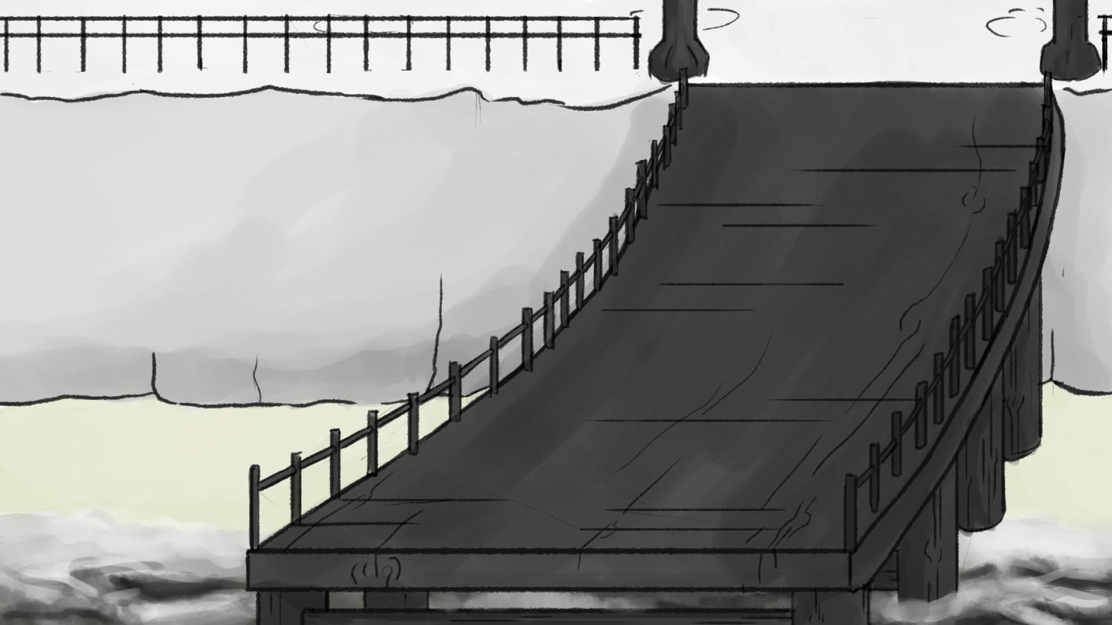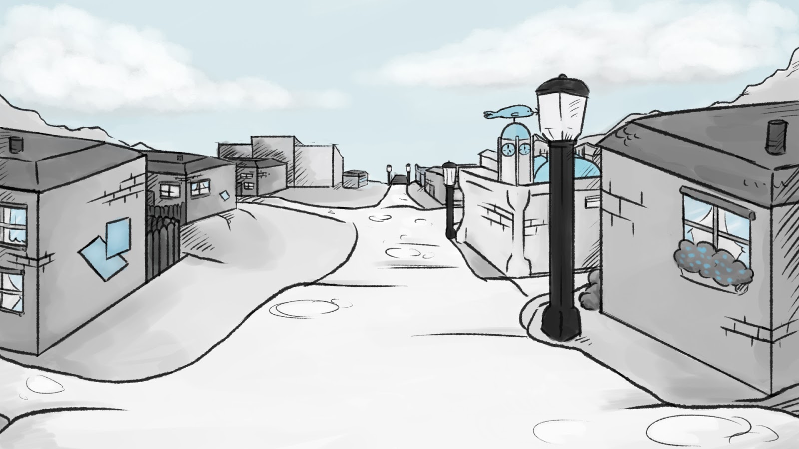
More background shots throughout this week. Shot 8 is whre Jenny comes over to Pup. This background was fairly quick and easy to do as there's little details here.
This above shot takes place just in front of Jenny's house. Somehow it doesn't feel like it should, I'm not quite sure how to change the angle in this plus with being strained for time to finish this project I think it's good as it is. Partly I think they layout of the town is not as steep friendly as it should be, but since we're trying to have a small seaside village it's hard to just give rows and rows of same houses since it will lose the feel of a quiet town. However I feel that my knowledge of drawing in perspective has grown. Estelle likes this and didn't say anything negative about it.
This shot on the right is practically the same as and one from previous post, however it's a little bit zoomed out. I felt that it would be better to redraw the panel but with applied changes. Somehow I feel that just zooming out of the already drawn picture and patching the sides would be rather difficult to do since the brush that we're using is pressure sensitive and going over the same place twice will darken the colour.
This is a shot where Jenny opens the door. I haven't had a good chance to draw Jenny's house properly, except for when the camera pans towards it in an early scene, since I drew a whole town for that. I feel that Estelle prefers to draw it since it is her own creation and I was happy with her taking one of the backgrounds and drawing it. I really enjoy looking at the rose bushes, I think that they do a good job at adding a good feel to the house. I've changed it twice because of the height, other then that it was a pleasure to draw. I'm feeling good with the progress that I'm making with the backgrounds and I'm hoping to jump into colouring animation shots soon.
Wednesday, 26 February 2014
Thursday, 20 February 2014
PRODUCTION: backgrounds 40, 41
Here is shot 41, this was the shot that I was worried about with being static because this is a big chasing scene and it looks really good so it would be disappointing to have a bad background ruin it. After I have done changes to background 35 this wasn't too bad to do since I knew where to begin and worked from there. After putting the animation and background together it looked fantastic and I'm really happy that this works as a background.
Background Shot 41
I had little problems with this shot since Jenny occupies most of the screen space anyway so I did not want to add any elaborate details in the middle of the drawing, also when I look at the overview of town there really isn't anything anyway. It didn't take too long to draw.
PRODUCTION: backgrounds 47 and 35 (new)
Shot 47
Along with the process of drawing shot 47, I have looked up at some of the previous shots that still needed to be done and came to conclusion that shot 35 is throwing everything off balance because of how far Pup and Jenny were and it would make later scenes look very very static with exception of camera being on rolling away Pup. I'm really surprised that no one has noticed that mistake, I guess that in my excitement for submitting my first background shot I didn't take in the geographical placement of the scene and after discussing all the problems and complications that would follow afterwards if that wasn't fixed quickly. I have changed the view and place of where shot 35 should be taking place and everyone agrees that it's much better and it also gives off the feel that Jenny and Pup are at the top of the hill. I'm rather happy that I have noticed that because it would definitely derail my work process and put me behind schedule which is something I do not want, since some of the already done backgrounds ate into my schedule. I am hoping to catch up with everything.
NEW Shot 35
Saturday, 15 February 2014
PRODUCTION: backgrounds 3, 9, 17&18
These three backgrounds did not take that much time to do. They are featured in the earlier scenes. Background 3 will have animated sea by Estelle, this is why I have done this shot earlier so she will have enough time to animate the splashing waves against the poles of the pier. The last background will be used in two shots since there is little camera movement. I feel that it's good to step away from some very detailed work to do some really simple back drops.
Monday, 10 February 2014
PRODUCTION: background shots: 35, 42, 44
After finishing the background shot 18.5 I have moved to starting the outdoor shots which are my second job to do. Here's shot 35, after doing most of the work on it I have realised that the space between the town hall and the house was too small and it just looked unnatural. So after patching up the piece I think I have improved it and it definitely looks better, we have placed an animation shot on it to see how it looks and it worked perfectly. I'm really happy with how it looks and I'm more confident in what I'm doing. I can't wait to see all the backgrounds and animation pieces together.
Shot 35
Afterwards I took on the task of drawing other assigned shots (42, 44) however after their completion, me and Estelle tested them behind the animation and unfortunately they didn't work. The animation was out of place and just didn't fit therefore I chose the task of redrawing them again but this time with help of already finished animation. This definitely made the job a lot easier
Here are the original images:
and here are the improved backgrounds
As you can see they are not that different but it is important for the backgrounds to be in sync with the animation for it to look natural.
Friday, 7 February 2014
PRODUCTION: Background 18.5
I have worked on this town plan for almost full week. This piece is three times bigger than the normal background shots that will be used, this is because there is going to be a close up on the staircase and then the camera will move up towards Jenny's house (the last house in the backdrop), this is why the bigger size so there isn't going to be a loss in quality of work.
Here are two versions, one lined and the other fully coloured.
Furthermore there were few small details added later after I gave this to Estelle, like the wash-like effect to the lines, as well toning down the colour of the pavement since it's too white. Other than that everything was how Estelle expected, she will later add the sea which will be animated in Photoshop.
Subscribe to:
Posts (Atom)