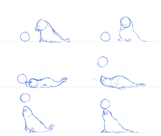
After receiving feedback from Hilary about the animation test, I decided to actually change them since they went to the end of my do to list since I need to keep Stella updated with my background concept work.
Here are the all the redone animations with a head turn around. I haven't tried something like this before so this was nice to test out my knowledge and linework.
Friday, 15 November 2013
Thursday, 14 November 2013
Final preproduction drawings
Stella has appointed for me to draw concept art of two screenshots which will be painted stills. These are not going to be used as the final shots however I will heavily use them as reference and as even basic linework to down the working time on drawing out the scene again, the final drawings will most likely be on 300ppi/dpi to ensure the quality of drawings and so not stretching and pixelation will show up during the process of lining it up in Premiere.
Both of the drawings are copying a watercolour style. Therefore there is a process to obtaining desired style. First the linework has to be done in a specific brush set to Multiply with Opacity of around 70+% afterwards that layer is copied and pasted over the original and then a a Gaussian Blur is set (at 3.5 inches) this gives the work an effect as if the ink is bleeding over the watercolour paint. Lastly a watercolour paper texture is applied at the top of all the layers and set to multiply with a opacity less than 40%
Here are the finished results of two of the main drawings that will be referenced to final cut. I'm really happy with how they are looking, especially that watercolour effect.
For the drawing above it took me many tries to get the desired look as I couldn't work out at what angle the buildings needed to be set and drawn to show a perspective of looking from the top of the hill, or otherwise known as to where Jenny's house was. In the end I decided to use Google Maps and get a view of the Steep Hill since it has the same feeling of the angle as the street view above.
Here are some trial and error drawings:
I have even used a map overview to work out what would Jenny be able to see if she stood in a given direction since me and Stella wanted for her to look at the see without getting her line of sight obscured by some of the bigger buildings at the front of the pier.
As you can see I have drawn over a Google Street view to get a sense of the angled feeling and to work out the angle that drawing needed to be to achieve that look.
Final Extra Buildings
 As it can be seen I have referenced a previously used photo reference of a pub. I'm rather happy with this design even though it will not be seen in the final cut, well up-close anyway, I feel that many people would end up going to it in the cold winter days. I had a lot of fun designing the logo for the pub, I thought that it needed a seaside theme to it however I ended up going for a name called the 'Sleeping Wyrm' since my sea serpent turned to just a serpent.
 This is the arcade design, it's located at the front of the pier. As much as it looks really gloomy but it's only because it's closed for the winter time, therefore all the lights are turned off, the shutters are down and even a small car ride is hidden under a cover to protect it from the harsh winter weather.
Lastly a row of shops. Ella is the original designer of these shops. I just took to the style required for the project. Again these shops have closed doors because of the winter and little amounts of tourists during that time. I thought it would be a good idea to draw out the front view of these shops to get a solid form of them and use as reference during the production process.
Thursday, 7 November 2013
Concept work: finalising the town
Here is a new look on town, I have kept the same angle as in the previous draft of the town however here I have added extra buildings to the front of the cliff using Ella's design as reference since we agreed that it looked better and more authentic than the previous version. Here is some work in process from line work, block colouring to shading and putting in details to the buildings. I'm really happy with this and I hope that we'll use this as a base in the project. It would only need to have increase PPI (pixels per inch) to achieve the high definition standard. This drawing at the moment has 100 ppi.


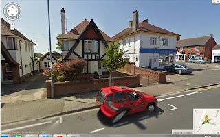
For some of the buildings I have used references to aid me in drawing out a given building like a pub, the arcade or even the row of three shops.
Here are the reference photos that helped me:
Tuesday, 5 November 2013
Concept of town: general view and extra buildings
I have taken the task of drawing a draft of the town in the story to see how it would look like in general and to see whether the town map that I did worked and made the buildings flow.
Here are the three stages of how I drew this piece:


As you can see the first drawing is a sketch of the town view. In this I had to work out how to place the buildings as well as see what angle the camera view I would have to use to make that drawing work. The next piece is lineart, in this clean up version I have added details like windows, doors and signs to the buildings. Lastly the finished coloured piece, I have decided to colour certain buildings with blue hints to make them stand out more than the houses. I have kept a lot of the buildings as simple squares with little details added to them as this doesn't have the big resolution as a drawing and because this is a draft. Since I'm working on the concept of town with another person I have just used my example town plan, later we will compare our ideas and try to work out the best scene for this story.
Here are the three stages of how I drew this piece:


As you can see the first drawing is a sketch of the town view. In this I had to work out how to place the buildings as well as see what angle the camera view I would have to use to make that drawing work. The next piece is lineart, in this clean up version I have added details like windows, doors and signs to the buildings. Lastly the finished coloured piece, I have decided to colour certain buildings with blue hints to make them stand out more than the houses. I have kept a lot of the buildings as simple squares with little details added to them as this doesn't have the big resolution as a drawing and because this is a draft. Since I'm working on the concept of town with another person I have just used my example town plan, later we will compare our ideas and try to work out the best scene for this story.
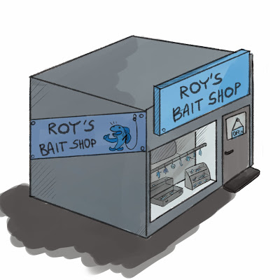
Moreover I drew some special buildings out of the town view, they have more added details. So far I have managed to draw a town hall and a bait shop.
For this town hall I have used this photograph as a reference, I simplified my town hall because it doesn't play a major role in the story however I feel that it should be shown with details. I have added a little seal as a wind maker that you can find on some buildings. I thought that this added a special touch to the town hall and it's a special little thing as a seal is part of the story.
The next special building is the bait shop. I have two versions of it. The first one was done before my feedback from the team leader and the other is after feedback. There aren't many changes done to the whole design, I just received few pointers in making the shop look more attractive and realistic in the amount of details and props.
Subscribe to:
Comments (Atom)


